As a park-shelter design unfolds, it takes the shape of … triangles?
By Jamin AAsum
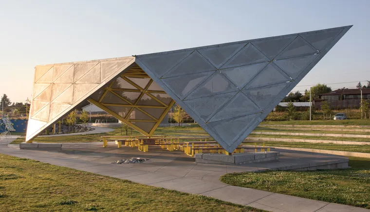
Designs that appear simple and resolved are often the result of a painstakingly detailed process. While a park shelter at Luuwit View Park in Portland, Ore., appears to be a simple collection of triangular shapes, there is a complexity behind the presentation.
The sculpture-like shelter is part of the new park created four years ago. The hourglass-shaped area is laid out along two datum lines that direct a user’s eye to Mt. Hood to the east and Mt. St. Helens across the nearby Columbia River to the northwest. 2.ink Studio landscape architects designed the 16-acre park, the result of an exhaustive public process that involved 26 interest groups from diverse surrounding neighborhoods. The park is inclusive, featuring a full-size soccer field, skatepark, nature trail, dog park, community gardens, playgrounds, and the shelter, which also serves as a stage for the amphitheater. The folded triangles of the shelter sit at the intersection of the two pathways. The structure was designed by Skylab Architecture in Portland, with Jamin Aasum, AIA, as project designer and Jeff Kovel, AIA, as the partner in charge.
As Skylab researched the context and history of the region, design concepts took clues from the surrounding mountain peaks and the indigenous shelters that had populated the area. At the initial design meeting with 2.ink, Skylab created small, matchbox-sized, cardboard models. The models shared an origami-like language of triangles, and were based on the idea of making a non-directional, asymmetrical shelter that would rest lightly on the ground. The angular shelter that emerged from the initial design is informal and approachable but with a sense of movement and energy, as if it was a bird about to take flight.
Form Follows Function
The design goal was to create a sculpture-like shelter that would activate the park and also be easy to maintain. The simple form performs on multiple layers of program and function. Using the physical models, the forms were manipulated and eventually documented on a computer. Adhering to a simple but rigorous idea, the design was divided into a series of equilateral triangles expressed at different scales. The final design consists of five interconnected triangles—two large triangles for the roof and three triangles of similar size for the three legs. The triangles are further divided into smaller triangles, which in turn are made of even smaller triangles.

The connections making up the simple forms were unusual enough that engineers had difficulty using traditional computer modeling to calculate forces. After much experimentation, a Skylab designer used a Grasshopper plug-in, which does algorithmic modeling to map each point with identifiable coordinates. The team was then able to push or pull points to align the geometry, as they had with the physical models. Understanding the coordinates for the points, engineers were able to use traditional modeling to calculate forces and also for city engineers to check the calculations.
The design team met with the contractor and fabricator to determine how the shelter would be assembled and transported. The contractor determined the shelter could be shop-fabricated in sections sized to fit on a flatbed and trucked to the site. The structural engineer sized the final, structural frame connections.
The repetition of similar modules made the cutting and fabrication process more efficient, allowing for the shelter to be quickly assembled in place with minimal site-welding. Although rare in public projects, the team’s ability to develop construction details with the contractor and fabricator was the key to its success.
Simple Durability
The team worked closely with Portland Parks and Recreation to fully vet all aspects of the design. The shelter’s perforated, triangular support legs extend to the ground, providing protection from the gorge winds while allowing transparency that enhances park safety. The angles of the shelter’s sides were adjusted to reduce climbing-risk without adding barriers. The legs rest on angled concrete bases that double as benches and incorporate lighting fixtures and power.
With the goal of creating a timeless structure, the team developed mock-ups of the shelter’s panels and tested them to determine their ability to withstand abuse and vandalism. Steel 3/8-inches thick was chosen and perforated to create transparency. The perforations are 5/8-inch holes staggered on 1-inch centers—large enough for transparency but small enough to discourage climbing that might result in getting a finger stuck.
The steel-plate panels are attached with a hidden fastener system to a steel pipe frame that follows the same triangular pattern. Visible connectors were eliminated by welding threaded studs to the back of the panels before galvanizing. This allowed the panels to be attached to the structure without welding, which speeded up site work and allowed for an individual replacement if required.
The initial concepts called for all elements to be hot-dipped galvanized for an economical and durable finish. Galvanizing and the way it dulls as it ages were also attractive because it created a timeless and monolithic quality. Research was done into graffiti resistance and removal, and the galvanized finish was deemed an appropriate, long-term solution. The finish matches the triangular restroom building that has a butterfly roof. The restroom has four, single-use, ADA stalls and houses the pumps for the park's misting-water feature.
The need for site-welding compromised the galvanizing, so the team decided to paint on-site the main structural frame. A bright-yellow industrial paint was chosen, and the color quickly became iconic and beloved by park users. 2.ink Studio specified yellow picnic tables and benches that are permanently secured under the shelter, tying the ensemble together.
The artist, Mauircio Robalino, located a sculpture called “Bird” on a nearby rounded hill, built by the landscape architects. The angular sculpture and the shelter gesture to each other, reinforcing the idea of geometry that Skylab established, and contrasting with the curving organic lines of the park layout.
A Flexible Process
As the project progressed, meetings often resembled a rowdy family’s dinner party, but a visionary parks and recreation project manager didn’t flinch and worked with the team to establish a consensus and maintain the design’s integrity. The process required trust and commitment from all those involved and, above and beyond that, clear and consistent communication. Establishing clear goals, developing an in-depth understanding of the issues, and controlling project costs finally got the vision built. It was a leap of faith for the city of Portland to allow the process to evolve into a successful park shelter. In place for five years, the park has become a center of activity, home to picnics and family reunions, and the amphitheater is filled with music on summer evenings.
Jamin AAsum, AIA, is a Senior Associate at Skylab Architecture in Portland, Ore. For more information, visit https://skylabarchitecture.com.

